Posted by SolidShops on March 07, 2012 at 05:22 PM
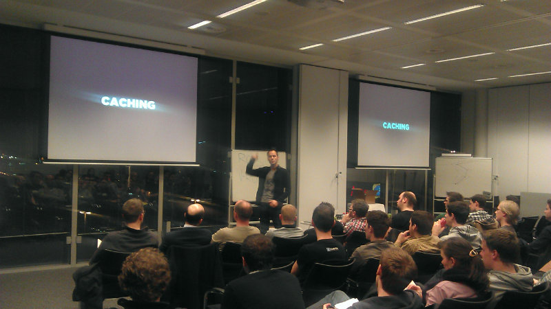
Our friends over at Fronteers asked us to give a talk about the lessons we’ve learned in the progress of building SolidShops.com. I was more than happy to share my personal experiences with fellow web developers and designers and headed over to the Belgian Microsoft headquarters for an evening of learning, presenting and socializing afterwards.
In case you weren’t there, here’s a chance to grab the slides I used to give my talk. I sure had a blast being there and hope to meet you on one of the following web designer meetups or conferences.
Posted by SolidShops on February 21, 2012 at 08:43 AM
Did you ever think about picking the right colors for your store? If you did, you might know that the colors red/orange, black and royal blue (Burger King anyone) attract impulse shoppers and tend to show up a lot at outlet malls.
Warm exciting colors like red make you feel hungry and energetic. Lighter blue on the other hand makes you feel secure and trustworthy about a brand or store. That’s why so many banks have – you guessed it – blue logo’s and branding. Not that our banks can be trusted as much as they could be in the older days, but then again, a red logo wouldn’t help much.

Our friends at KISSmetrics have made an interesting infographic about how colors can affect purchases.
Not only do colors affect what kind of customers you’ll be attracting. The use of power words can also evoke certain emotions. For example: the infographic mentions that 52% of consumers are more likely to enter a store if there is a sale sign in the window. Definitely worth giving a shot in your online store as well.

Posted by SolidShops on December 10, 2011 at 09:40 AM
When doing support for SolidShops, we often receive interesting feedback from our users. Today, I had the chance to have a short conversation via email with the very friendly Jessa B who was looking for a solution to power her fabrics store. When I asked her about what she didn’t like about her current e-commerce solution (we won’t name names), she sent us the following feedback:
 It’s such a heavy piece of software that upgrades and simple customizations become big nightmares that have to be outsourced even though I have a pretty good handle on CSS and HTML. It’s also not as speedy and responsive as I’d like it to be — particularly in the backend/admin side. And because I’m on the Community version, some basic functions — like good control on shipping costs, use of gift certificates and a search function that actually works to help customers find products — seem to be lacking without paying for 3rd party extensions that may or may not ‘break’ or be compatible with my already existing site. — Jessa B
The feeling I had after reading that mail was: wow, she really hits the nail on the head. I’ll never claim that SolidShops is the perfect solution for every single business in the world, far from it, but this email exactly describes why we started building SolidShops in the first place. We think that most e-commerce software is too complex and limitative, especially for web designers.
The takeaway point here is to always ask your clients what they don’t like about their current solution. Ask why they prefer your solution instead of going with a much more well-known application. You probably think you know why clients prefer your software – you’ve built it after all – but until a client tells you the exact reason why, you’re just guessing and hoping you’re right.
This time, Jessa hit the nail on the head and confirmed our beliefs but sometimes user feedback will give you insights into the strenghts of your application that you might not even have thought about. Your clients won’t lie, don’t be a fool by not listening to them. If you know what frustrates them, you can focus on creating a real solution for them.
Thanks for sharing your opinion with us, Jessa.
Posted by SolidShops on June 19, 2011 at 06:05 PM
Last week we launched the first version of our mobile web app.
When building mobile applications you have a few different options. The biggest choice one has to make is going native versus going web based. In this post I’d like to explain why we decided to build out a mobile web app and not a native application for iPhone, Android or another specific single platform. Let’s go over the pro’s and con’s of both approaches in a nutshell.
Native mobile apps
Pros
- offline capabilities
- performance is often better compared to apps running in the browser
- app stores make your app more easy to find or discover in one central location
- better overall user experience
- you can more easily access device specific hardware capabilities such as the accelerometer, GPS, camera, …
Cons
- targeting multiple platforms requires different apps and programming methods
- you have to publish your app to multiple app stores (BlackBerry App World, Apple App Store, Android Market, … )
Web based (HTML5) mobile apps
Pros
- you have offline capabilities as well: html5 database storage API
- only one version of the app is enough for all your users since it runs in any mobile browser
- you can easily re-use your existing codebase
- no need to learn a new language or technology, you can use your web skills
- updates instantly affect all users without going through an app store
Cons
- it’s more difficult to access specific hardware capabilities of a devices (camera, accelerometer, …), however this might happen in the near future
- performance tends to be a bit slower in the browser, although this can also change over time
- it’s more difficult to get the same user experience as with a native app, e.g. gestures are more difficult to mimic in the browser
Hybrid Mobile Apps
To make things even more difficult, you can also decide to mix both of the approaches mentioned above by building your app in html/css/javascript while at the same time leveraging the power of frameworks to access hardware capabilities of a device. This can be done by using frameworks such as PhoneGap or AppCelerator to build your hybrid apps.
The number one advantage of this mixed approach is that you can use techniques you already master (html/css/javascript) to build your app and then deploy to multiple platforms at the same time. Depending on the framework, you’ll be able to deploy your app to the iPhone App Store, the Android Market and even to the BlackBerry App World.
We chose not to go native, we chose something else
For SolidShops, the choice was rather straightforward. Our goal is simple: be the best and most user friendly ecommerce platform out there for web designers and their clients.
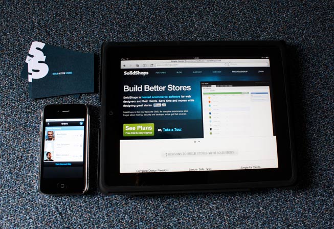
We want everybody to be able to check their orders on demand, no matter what platform they are on. We don’t need access to all the fancy pants hardware stuff like your camera and GPS. We want to be able to push out updates whenever we need to without Apple deciding whether or not to accept our app.
We chose to go web based with jQuery mobile and think that is absolutely the best approach for us and our users.
Not convinced about the power of the mobile browser? Read here why HTML5 will kill the native apps as we know them! We hope that you will all enjoy the mobile application and as always are looking forward to your feedback. Let us know what we can improve to help you build better stores.
To use SolidShops on you mobile device, simply point your mobile browser to https://m.solidshops.com and login with your store credentials. Happy surfing!
Posted by SolidShops on May 11, 2011 at 12:54 PM
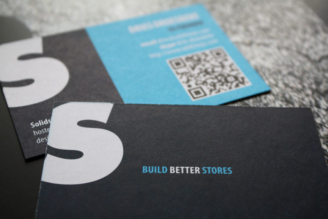
We recently made a couple of business cards for our team to give out whenever we meet interesting people. When creating these cards we’ve learned a number of things that make the use of QR codes on print such as business cards more efficient.
If you are thinking about using QR codes for your next round of business cards, the following tips may come in handy to save you time and frustration.
Always use short url’s
QR codes tend to get more complex when you put more information in them. Therefore it’s best to use a URL shortener if you want to open a web page when the users scans your card. We use goo.gl which creates a QR code for you automatically, bit.ly does the same thing. The only downside is that they don’t provide a vector version of the QR code, which is handy when designing your cards.
If you want to generate a vector QR code, use this tool which even has an API.
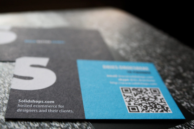
Make the QR code large enough
Not everyone is packing a 10 megapixel camera on their mobile phone. Make sure you test your QR code on different devices. Our first test printout had a QR code that was slightly smaller and while it worked great on iPhones, some older Android and Windows Mobile devices were having trouble recognizing the code.
This has nothing to do with the platform you are on, but with the resolution of your mobile camera. Test, iterate and test some more until you have found the perfect balance between QR code size and scannability.
Use black on white
Although we’ve had some success with a dark blue QR code on a light background, things seem to work best when just using a black QR code on a plain white background. Use colors anywhere else on your cards, but try to stick to plain black and white for your QR codes.
Track results
You will want to track how your networking efforts are working out. While sending a short email reminder after meeting somebody in person is a good idea, it’s a good idea to track your QR code campaign in any analytics tool. We use Google Analytics to keep track of how many people have scanned our cards.
Tease, reward, provide value
Reward anyone who takes the time and effort to see what that QR code on your cards is all about. Don’t just send a person to your homepage but create a separate landing page for those adventurous souls that have scanned your card.
We have set up a landing page with a little surprise for anyone who has gotten their hands on one of our cards.
Happy networking everyone!
Posted by SolidShops on May 09, 2011 at 09:29 PM
What would you do if you would win the lottery? Would you still be doing the work you do today?
For me the answer to that same question is absolutely yes. I didn’t really win the lottery, I don’t even play on it, so that kind of limits my odds of winning. But I do know this: if I would win the lottery tomorrow, I would still be running SolidShops. I would also keep teaching my students about web development and server management. That’s exactly what I do today and it’s what I love doing most.
Personally, I think that’s just as good as winning the actual lottery.
Of course here at SolidShops we have good days as well as bad days just like everywhere else. But that’s ok, it makes you appreciate those great days even more. What’s important is that you stop doing what you’re doing from time to time and think about it: are you doing what you are really passionate about?
If not, why not pivot into something what you really love doing. In the end, you only have one journey. Make it count.
Today we had a lot on our plate to discuss. The weather in Belgium is exceptionally good these days so we decided to enjoy the sun a little and went out to have our meeting on a sunny terrace in the city. We actually ended up having a very productive meeting and enjoyed it tremendously. After the meeting, we had some amazing Belgian beer to top things off ;).
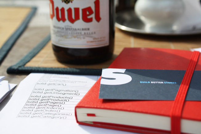
Don’t feel guilty about those days where you are less productive than you could have been. Sometimes the journey is more important than the outcome and walking that road will bring you one step closer to winning that lottery, without buying a ticket.
Cheers to that.
Posted by SolidShops on May 02, 2011 at 12:25 PM
Earlier today we received a support email from one of our clients that actually made me smile throughout the day. The following is a direct quote from that email:
“I am actually excited about using [SolidShops] which unfortunately is not how I feel when I log into Magento”
No expensive gifts, no jokes, just a very honest sentence in a support mail is what it took to make me smile and feel good about our work. From the beginning, we have focused on making SolidShops easier and more pleasant to use than other ecommerce software out there.
It’s amazingly rewarding when somebody notices why we go the extra mile. Thanks for making me smile today, you know who you are ;).

Photo by Alan Cleaver
Posted by SolidShops on December 12, 2010 at 06:13 PM
Building a brand takes effort and time, there’s no doubt about that. On top of that, it’s a process that’s never finished. Last week, Mikaël, our creative (or should we say crazy) graphics designer came up with some sketches to boost the SolidShops brand a bit.
He came up with some ideas for using a mascot throughout the service. A rhino sure is Solid, just like SolidShops. What do you think about using this on our website and cards?


It can use some extra polish, but for a first iteration we think it matches the SolidShops app and brand nicely!
Posted by SolidShops on September 10, 2010 at 02:56 PM
So you’ve launched your SaaS (Software As A Service) web application and are ready to sit back and relax? Not very likely. After analyzing, planning, developing and marketing your application you will have actual and real users on your application that love/hate/request features. In this post I’d like to share some of the things we learned while building and improving SolidShops. Even though we haven’t launched yet, we’ve been through several iterations already because some things just weren’t working the way our users expected them to work.
The first thing you will notice after launching any version of your shiny new app, is that you will need to make some improvements to accommodate your users. Sure, you can come up with some great features and as a web designer you might think that you know all about your users but that’s just plain silly. In the end, your users are the only ones that matter when it comes to the success or failure of your app, so you better start listening to them and only them.
Because we haven’t launched our application into the webosphere yet, for us the only way to get reliable and useful user feedback was by going to our pre-beta testers, sometimes friends, sometimes just acquaintances. We took our laptops with us and let Silverback do the heavy lifting for us. Silverback is a simple Mac application that records the users screen and face.
We came up with a number of tasks we wanted to test like signing up for an account or adding products to a store. We passed that scenario on to our test users and just let them go nuts with our application. After that, we’d analyze what our users where struggling with or what went smooth.
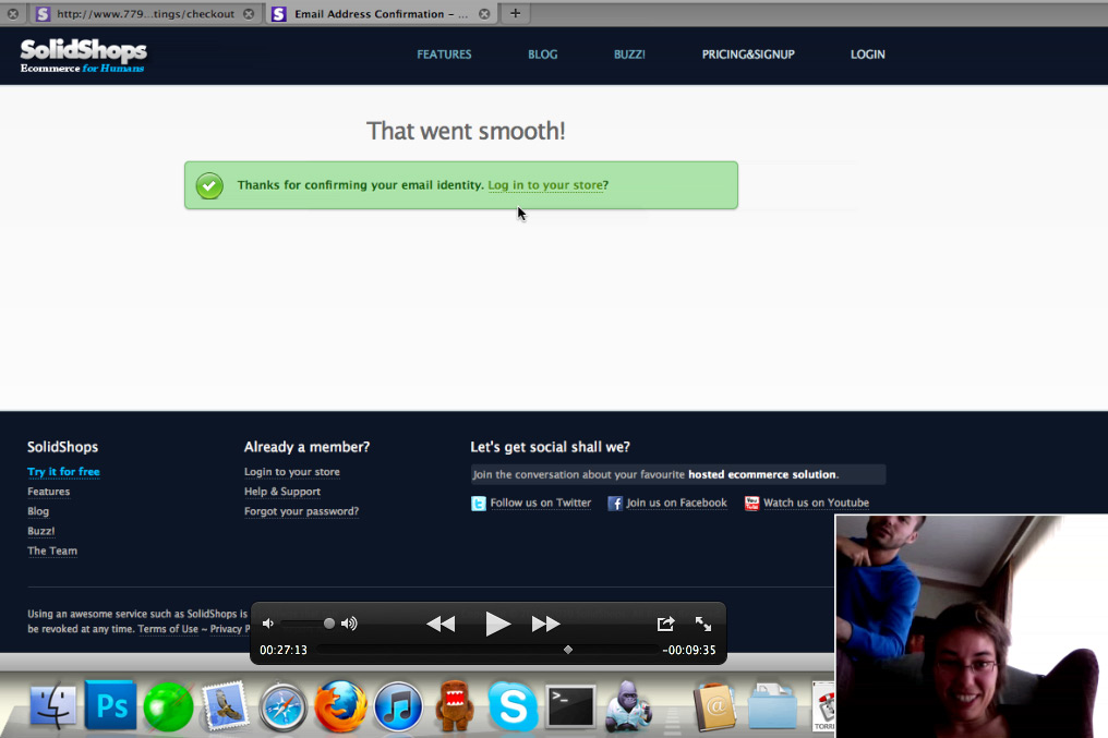
Plan for interations from the start
For us, iterating the application based on user feedback was a no-brainer from the beginning. We don’t even expect to ever have a finished application that can just sit there on a server for the rest of days. Instead, we’ll be constantly improving the application whether it’s by tweaking something small or by building or remove features.
Make sure that you plan to iterate from the start, when you launch a web application. This is necessary to get you into the correct mindset, but not only that. Your application needs to be built for iterating. Make sure that your setup and code allows you to easily change stuff, add new features or even throw stuff out if nobody is using it.
Let your mom test your app
That’s right, your mom can test your app and give you valuable feedback right from the start but only if you mom is in your target audience. If you are building an application that focuses on hardcore linux system admins, I don’t think your mother will of much use for getting user feedback, unless she’s got ROOT ;).
Enough with the geek talk. Take your laptop, invite some users that fit into your target audience and let them perform a number of actions on your web application. Don’t help them, just tell them what to do and let your users try to accomplish those task like “sign up for a new store” on their own. Let them tell you what is difficult about the process and take notes.
When performing usability test we always emphasize that we are NOT testing the user or the users capabilities of using our system. We are testing the application itself. If a user can’t complete a certain action, the application has failed, not the user. Not only does that put the user in a more comfortable place. On top of that the user will not be afraid to try out certain things in your application, which is absolutely necessary in order to get natural user behavior.
Iterate
We love to work with mockups to sketch the layout of a screen before we actually build it in HTML. When working in a team, it’s just easier and faster to talk about a mockup you came up with instead of designing it in Photoshop and then talking things over. If something’s wrong with the mockup (we use Balsamiq for that), it takes only a few minutes or even seconds to adjust. When you’ve reached consensus about how a screen should look like and how it should work, you can build it and not earlier.
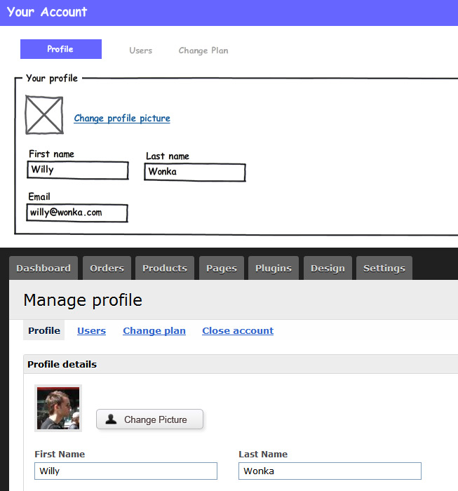
Deploy the new version of your app to your server and you’re ready to start all over again. Conduct the same user test with a new test person and see if the screen still disrupts the process or action you asked the user to complete. If not: great. If the screen still isn’t working, ask the user what’s wrong or difficult about the screen, but don’t ask for a solution. You are the designer and you are the one to come up with a solution.
We are not usability experts, but we do care a great deal about our users’ happiness. This blog post is about how we improve our application, not about the only or best way to conduct usability tests. Feel free to share your own tips and thoughts on iterating and improving your web apps below in the comments.
Bonne chance and happy testing!


Let's get social shall we?
We'd love to know what you think. Join the conversation about your hosted e-commerce solution.